La PDGA estrena logo
Ayer se hizo público el nuevo logo de la PDGA. En el artículo de pdga.com describen el acontecimiento como el amanecer de una nueva era. El logo ha cambiado varias veces a lo largo del tiempo y seguramente dará mucho que hablar. Aquí os dejamos, en versión íntegra, el artículo de la PDGA.

For the first time in more than 25 years, the PDGA has updated its branding, including its primary logo, accompanying icons and colors.
In the summer of 1976, when "Steady" Ed Headrick sent a stack of letters inviting frisbee-loving friends to join the new Professional Disc Golf Association there was little in the form of “branding” for the sport’s new players’ association.
Typing out the words would suffice.
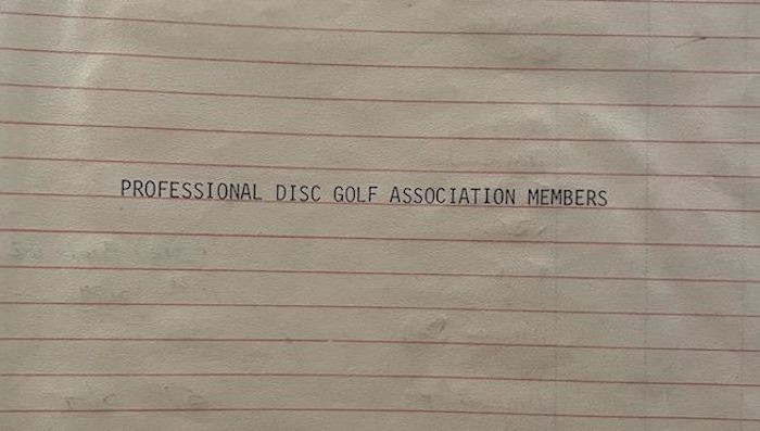
The cover sheet of the first PDGA membership records, circa 1976, currently on display at the International Disc Golf Center in Appling, Georgia.
Yet, it was official enough to entice dozens, and then hundreds, to secure a lifetime membership for the lofty price of $10.
These one-, two-, three-, and four-digit members shaped the identity – the brand – of the PDGA through the late 1970s and into the 1980s.
The First PDGA Logos
The earliest associational members received a gift – a set of 119g and 141g discs, each bearing the new members’ unique PDGA number and a few other consistent markings. That silhouette throwing a disc across the flight plate and into the basket suffices as one of the earliest graphic marks for the PDGA.
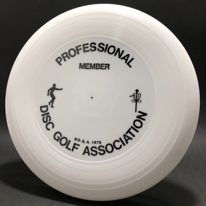
Photo credit: Christopher Mattison, FlyingDiscMuseum.com
By 1984, the PDGA was in a transitional phase. Steady Ed had recently given over control of the organization to a group of engaged players and things were rapidly organizing. From 1985 to 1988, a new logo – a swooping disc flying into a slightly abstract basket – was used with some consistency on printed materials.
![]()
Beginning in 1989, a detailed, somewhat realistic image of a basket with a disc hitting the chains became a standardized mark on a number of PDGA items. Kent Johnson (PDGA #4547), in response to a call for designs by Disc Golfer magazine editor Joe Feidt, designed the mark. The graphic appeared as part of the “Disc Golfer” newsletter heading and appeared on collateral items, including discs and minis, through 1996.
![]()
Around this same time, an artistic rendering of the PDGA letters, infilled with the image of a disc golfer putting, received some use as a logo as well. Yolanda Hall (PDGA #4503) is credited with this logo design.
The Logo You Know
Based on historical membership data, around 95% of all PDGA members joined during the "era" of the current logomark.
By late 1995, momentum was building to create a new branded mark for the PDGA. At the request of then-PDGA Administrator Becky Powell, Craig Dodds (PDGA #6933) of Massive Graphics put together some logo concepts for presentation in early 1996.
![]()
Among these concepts appeared a “throwing man,” inspired by similar two-toned silhouette marks like those of Major League Baseball or the National Basketball Association. However, instead of Harmon Killebrew or Jerry West, Dodds modeled his logo off of his colleague Mark Vasicek (PDGA #6190).
Soon after, in 1997 PDGA board member Kristi VandenBosch (PDGA #7867) modified the mark in several significant ways. The “D” and “G” were interlocked, and the color scheme altered to the green-and-blue palette that remains familiar to this day. (Some accounts state this throwing man was modeled after Ken Gill PDGA #3549.)
Since then, the “throwing man” and the letters “PDGA” in a classic serif font have served as the official logo for more than a quarter century, ushering in more than 230,000 new PDGA members.
The Next Era
Over the past several years, both internal and external voices inquiring about an update to the PDGA’s branding have increased in volume. While the existing mark was well-established, easily identified, and generally liked – not to mention, familiar and historic – those interested in updating the mark expressed valid arguments:
Representation: Those who enjoy disc golf, and those making up the PDGA membership, hail from all walks of life. There are juniors, seniors, professionals, amateurs, men, women – a complete cross section of humanity. As the current mark featured a silhouette of, apparently, an adult, caucasian male, the idea of a mark less “restrictive” was influential.
Global Reach: Although the PDGA is headquartered in the United States and acts as the national disc golf association for the U.S. and Canada, it is also the international governing body for the sport. Growing the game of disc golf around the world remains a major pillar of PDGA operations. Any new PDGA branding should take the increasingly global nature of the sport into account.
Usage: Certain aspects of the “throwing man” mark make it clear that it was born into an analogue, print-based world. In the years since, digital, screen-based communications have become the dominant form of interaction between a brand and its audiences. Furthermore, more partners, media outlets, and product manufacturers, etc. exist than ever before, each of which may require the need to broadcast or create products featuring the PDGA brand. A new mark must be versatile for use on all forms of media, yet simple enough to ensure all parties use the mark in consistent ways.
In November 2021, the Media & Marketing team at the PDGA initialized research into the PDGA brand. The group looked at internal brand guides, including mission and vision statements, corporate values and core competencies (i.e. the PDGA’s most overarching operational mandates). The team also explored other brands and brand markings in several categories, including international corporations, global sports associations, and disc golf organizations.
This lengthy exploration process led the team to identify a number of brand attributes that should be reflected in future branding and brand visuals:
- Authority
- Nature
- Community
- Innovation
As brainstorming and sketching progressed, it became clear the mark should be symbolic, but not complex. It was designed to be meaningful, aspirational, and timeless.
The New PDGA Brand
![]()
The new mark combines lettering with negative space – where the magic happens. Within the arc spanning the width of the graphic, the eye may pick out several images:
- The profile of a flying disc
- The horizon of the earth
- The dawn of a new day
And in the touching “DG”:
- The links of a basket’s chains
- The connection of the disc golf community
The blues and greens that will accompany the new logo remain familiar, but brightened. Green symbolizes nature, health, optimism and growth. Blue is professional, stable, sincere and trustworthy.
When asked about their passion for the sport, disc golfers of all ages and abilities often speak of their enjoyment of seeing a disc in flight, watching it glide and turn its way through the air. The new PDGA logo reflects that imagery among several symbols that impart a feeling of positivity, momentum, and a forward-thinking mindset, while staying true to the historical foundation of the game and the association.
This mark will be used in concert with additional branded icons, which will further highlight brand attributes such as the global nature of the sport of disc golf. It will also appear in a variety of "lockups," denoting the growing array of PDGA properties and initiatives.
A very special "thank you" to Kent Johnson and Brian Hoeniger for providing most of the photographs and other research for this story. And, thanks to all those that have contributed to the PDGA brand over the years.


Comentarios
Publicar un comentario